Don't just tally up the numbers; engage stakeholders by telling the story of your year through a custom interactive annual report.
There’s a lot that can happen in a year. There are those achievements to celebrate, like seeing a leap in website conversions, bringing in more revenue, and other success metrics. But then there are things that well… don’t go exactly as planned.
Interactive annual reports tell the stories behind the highs and lows. They give a voice to data points. Through multi-faceted user experiences, these reports offer insights and understanding that go deeper than what traditional reports can convey.
We’re going to take a closer look at what goes into creating custom interactive annual reports and why they’re so effective in connecting with people and communicating information.
In this article...
What are annual reports?
While today’s annual reports deliver information through dynamic digital user experiences, their origins are far less high-tech.
Let’s go back to the Great Depression. The United States’ stock market crash of 1929 was felt across the global economy. Because of the magnitude of damage, publicly traded companies were required to be more transparent about their finances.
The Securities Exchange Act of 1934 made financial reports mandatory for publicly traded companies and established standards they had to follow in terms of disclosures. Meant for the eyes of shareholders they contained financial statements, statistics representing profits and losses, and other relevant information in text-heavy documents, with minimal design embellishments. Only when graphic design and branding became more of a focus in post World-War II would they have any sense of artistry or creativity.
Companies and brands have come a long way from the impersonal days when neat ledgers and dry financial data were all that mattered. Today's annual reports go beyond mere numbers, letting brands express who they are and tell their stories through imaginative visuals and action.
Why bother creating custom interactive annual reports?
Interactive annual reports open up unique ways of presenting information. Instead of data sitting still on the screen, it’s touched by interactivity and motion. Data points are less likely to get lost in a layout and skimmed over, but rather stand out and receive closer attention.
Along with offering more impactful and action-packed user experiences interactive annual reports can also serve as an extension of a brand’s identity. The visual style, the tone of the writing, how data is presented, and other elements of a design can work well in amplifying a brand’s personality and connecting with its audience.
Traditional challenges of annual reports
There’s a lot of information that can go into an annual report. It can be tough to figure out what needs to be included and how it should be structured, especially if it’s going to be in a static format like print or a PDF. Interactive annual reports offer more flexibility in organizing content and giving readers multiple ways in getting to the information that interests them the most.
Traditional annual reports can also feel passive. Sure people can flip through them, but they don’t get greater autonomy over their experiences. Readers are observers rather than active participants.
The benefits of creating custom interactive annual reports
Content becomes more compelling
Interactive annual reports turn information into immersive narratives. By incorporating navigation options, user-initiated triggers, and interactive features, these reports allow visitors to control how they engage with the content, putting them at the center of the user experience. Interactive annual reports encourage curiosity and exploration.
Along with having various avenues for experiencing content, interactive reports also deliver details at a more measured pace. As visitors move through elements like text, data visualizations, images, and other features can appear at different times through user actions. Content can materialize through scroll-triggered fade-ins, appear in modal windows, or add additional details depending on what someone is doing or interacting with. Effects like parallax scrolling can also trickle text and images at different speeds, which breaks up the content into pieces that feel less rushed to go through.
Scrollytelling
Scrollytelling takes the most attention-grabbing facets of web design, in crafting compelling digital narratives. Combining scroll-triggered visual effects, parallax scrolling, dynamic graphics, background videos, and other elements, it leads readers through more than just facts and figures, but on a journey through the most important things that happened in a year.
Responsiveness
Interactive annual reports through CSS like flexbox and grid layouts, media queries, and other responsive design methods, can scale up or down depending on screen size, offering consistent experiences across different devices.
Interactive annual reports are easier to get out there
Printed annual reports can be expensive and hard to distribute. Interactive reports exist in digital form, making them easy to share through newsletters, links on a main website, social media, or through organic search traffic.
Analytics tracking
Interactive annual reports generate valuable data. Metrics like visitor counts, click-through rates, pages accessed, and other analytics show how a report is performing and what interests people the most.
Draw your readers in with data visualizations
If you have data like statistics, infographics, percentages, and other quantitative and qualitative information, annual reports offer engaging ways of presenting it through interactive data visualizations.
3D data visualizations
You might have data representing three features that can be mapped onto the x, y, and z axes of three-dimensional space. Visualizing them in 3D offers the chance for users to rotate and zoom in on the data points, revealing patterns and insights that aren’t as easy to recognize with 2D graphics.
Time-series animations
A single data visualization may reveal layers of information one at a time through visitor activities like scrolling. These are especially well suited for revealing chronological data or comparing changes from one year to the next.
Interactive data charts
Advanced filtering options, clickable hot spots, interactive timelines, narrative text, and other features, can add further context and meaning to numbers.
Examples of Custom Interactive Annual Reports
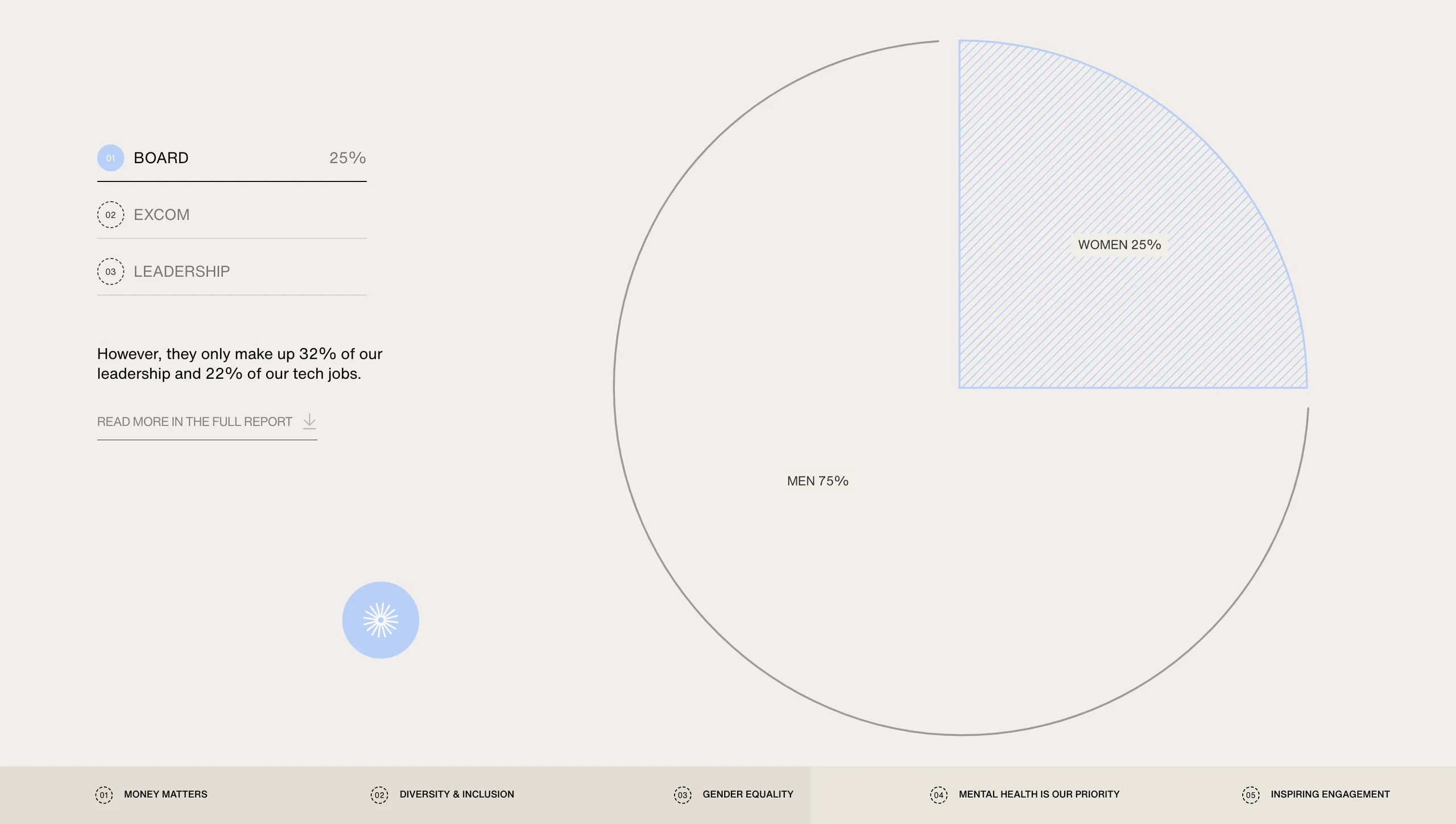
London Youth Sports
At the top of London Youth Sports’ 2024 Vev built interactive annual report they lay out the three main goals of their organization as:
- Ensuring sport is a fundamental right for all.
- Through sport, improve youth and community social integration.
- Deliver sport experiences that improve physical, emotional and mental well-being.
With these three points at the top, the rest of the design flows with animated data visualizations, writing, photos, videos, and other content that supports London Sports' main objectives. There's a lot of information, but its abundance of dazzling visuals, color variations, and big typography makes it easy to take it all in.
Swiss National Supercomputing Centre
The Swiss National Computing Centres’ interactive Annual Report 2023 draws from Swiss design’s traditions of clarity and minimalism, spinning it into something more modern and stylized. Visitors landing on this interactive report get a bird’s-eye view of where the center is located, depicted in fountain hand drawn styled illustrations. Mystical-colored spheres hover above the landscape, each transporting people to specific sections in an explosion of color.
Along with its more unique visual embellishments, you’ll also find the hallmarks of Swiss design, with neat grids, a focus on hierarchy, and neutral sans-serif typography for the bulk of its text.
UPA Développement International
Annual reports play a big role in helping non-profit organizations spread awareness about the causes they believe in and what they’re doing in trying to make a difference. UPA Développement International supports initiatives and projects that help improve the lives of farmers across the world.
This interactive annual report is propelled by visuals, with documentary-style photography showing the people they help, parallax scrolling effects, breakout horizontal sections of content, and data to communicate the importance of their work.
Vestiaire Collective
Sustainability reports are another form of annual report that let brands and organizations focus on their efforts in decreasing their environmental impact. The fashion brand Vestiaire Collective put their major accomplishments into this 2023 impact report, which evokes an aura of sophistication.
With a variety of scroll-triggered animations, lovely pastels, and data visualizations like number counters and infographics, it tells the story of their commitment to the environment that’s both straightforward and stylized.
Build custom interactive annual reports with Vev
There are so many different ways to approach the design of interactive reports. Whether you want to stick with something traditional or come up with something more experimental and inventive, the power of Vev's visual web builder is unmatched when it comes to creative possibilities.
Through an intuitive drag-and-drop UI, animations, integrations, and other web design essentials, Vev lets you put together annual reports that not only communicate a brand’s accomplishments, but captures the essence and spirit of who they are.