Critical to your content strategy are topic clusters, and these need a central hub. Enter: pillar pages.
Pillar pages are a long-form piece of content that serve as the hub for a topic cluster, branching out to related content on your website. The importance of design when it comes to pillar pages is often overlooked — but that’s where Vev comes in. With a variety of pre-built design components from scrollytelling sections to clickable image hotspots, and the ability to embed your Vev-built design straight into your existing website, it’s time to elevate this crucial part of your content strategy. We’ve got plenty of inspiring pillar page examples below that will give you some ideas for sprucing up your own.
What are Pillar Pages?
Pillar pages not only provide something educational but are filled with relevant keywords that may give them a boost in organic reach when people are searching for information about a specific topic. Brands often depend on pillar pages as important branches of inbound marketing that help people with an interest in a broad topic towards more useful content.
The Main Features of Pillar Pages
Pillar pages are a piece of long-form content often accompanied by an index or table of contents that aids navigation and helps people find the information that they are searching for.
Subtopics
While a pillar page may contain several main sections, these major points are often divided into subtopics.
Internal Links
Pillar pages have internal links that branch out to clusters of related content elsewhere on your website.
SEO
By their very nature, pillar pages contain a wealth of keywords, phrases, and search terms that should help them appear—and rank highly—in organic search results.
Design
Getting your copy ready and well-structured is step one. Now, it's time for the design. This is what will make the information you are presenting easy to digest, and it will keep readers engaged and scrolling.
9 Pillar Page Examples to Inspire You
From color to animations, horizontal scrolling to parallax, there’s a plethora of options for you to choose from when it comes to spicing up the design of your pillar page. Let’s take a look at examples that exemplify the importance of design.
Vev - Visual Storytelling Guide
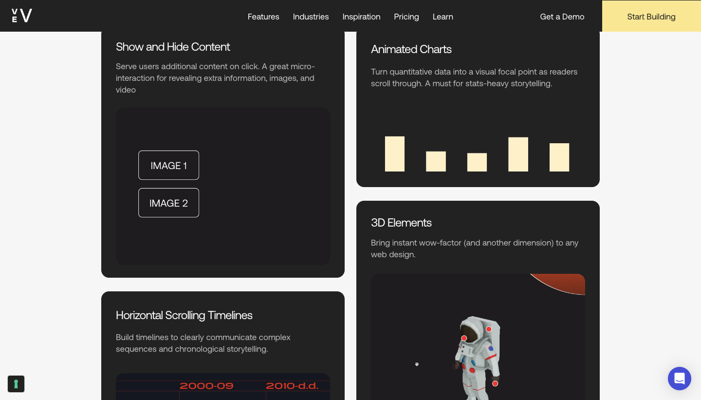
Kicking off this list of pillar page examples is one of our own. This pillar page on visual storytelling uses illustrations, graphics, animations, and images to aid the extensive information on offer in the text. This design is also in-keeping with the subject of the pillar page — visual storytelling not only offers compelling user experiences but relies on the aforementioned elements in communicating information and connecting with viewers.
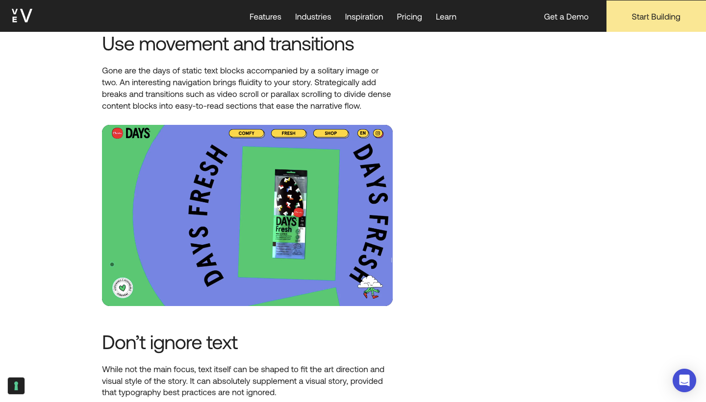
After an introductory section offering some background into visual storytelling, we then take our audience through the techniques, formats, and best practices. You’ll find plenty of detailed writing, but along with this information we take every opportunity to fill this with visuals. As well as interesting graphics and animations, there are micro-interactions and horizontally scrolled sections that help convey information and give it a dynamic sense of action. Pillar pages contain lots of information, so using these design components helps break up the page and keep the audience engaged.
Landbot - Chatbots: The Ultimate Guide
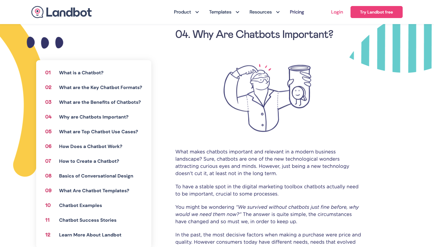
Landbot offers a no-code solution for creating and deploying chatbots. They put together a comprehensive guide that covers everything from how chatbots are designed and function, to the success stories of companies who use them. We always like seeing pillar page examples like Landbot’s that fully delve into a topic in helping visitors better understand it.
At the top, a fixed table of contents occupies the left-hand side showing all of the main topics covered as well as quick access to these sections. This effect could be recreated using Vev’s sticky position component. Throughout there are internal links to content elsewhere on the website, covering subtopics like conversational design, case studies, as well as chatbot examples.
Landbot provides an extensive guide to chatbots filled with meaningful writing, but also makes this an interesting visual experience. There’s plenty of personality in its line drawings of people, in addition to graphics that show how chatbots work.
Risotto Studio - What is Risograph Printing?
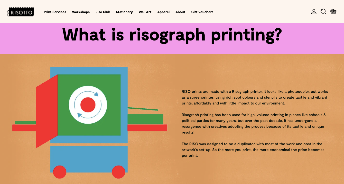
Known for its eclectic spot colors and lo-fi textures, risograph printing is a hybrid technology that combines photocopying and screen printing. It has a DIY aesthetic, making it a great medium for producing things like show flyers, zines, comic books, or art prints.
Risotto Studio specializes in this printing technique, offering risograph art as well as workshops. Their guide to risograph printing gives an in-depth look into how it works in a design full of vibrant colors and paper-like visuals that captures the look and feel of the prints it creates. Within the main body of content, there are calls to action to download ink swatches, experiment with ink samples, browse their paper library, and download a PDF of its “print bible” which is also a beautiful piece of design. If you’re looking for pillar page examples that have a strong sense of artistry, this is one you’ll want to check out.
World Wildlife Fund Canada - Regenerate Canada
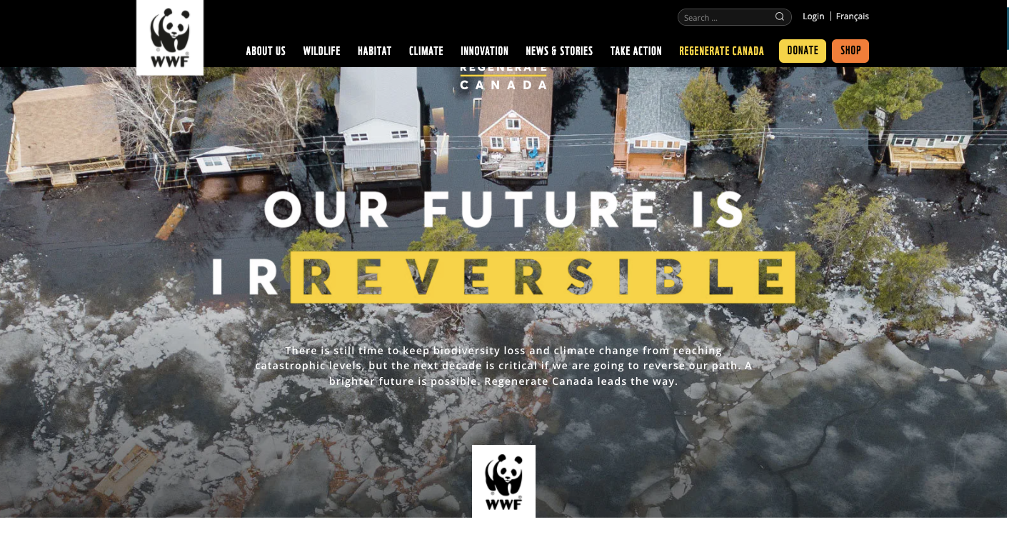
The World Wildlife Fund Canada was founded for a number of goals, such as to protect habitats, fight climate change, and maintain biodiversity. Regenerate Canada is its 10-year plan outlining objectives in cutting down on carbon emissions, maintaining ecosystems, and restoring environmental damage. This pillar page, built with Vev, goes into great detail about the Regenerate Canada campaign and why it’s important to take action now.
WWF makes its case through well-researched writing and data. Interspersed through the content there are internal links to sub-topics like indigenous-led conservation, the decline of species in Canada, and natural solutions to climate change. All of this supporting content ties into the goals of Regenerate Canada.
Along with its well-informed writing, this pillar page is rich in visuals. Throughout are brilliant nature photographs showing what’s at stake. There are also animations, parallax scrolling, and other effects that heighten its sense of interactivity.
Spotify In Focus - MERCH + MUSIC
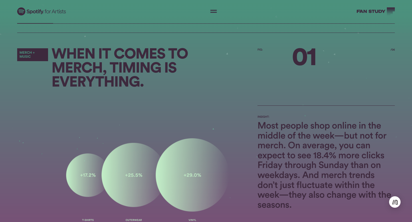
Spotify certainly focuses on its listeners, but they also put much effort into helping out the musicians who rely on their platform. Spotify’s In Focus is a resource for musicians, offering information about how to expand their fan base, promote their music, and how they can bring in more revenue.
Merchandising has become a huge part of many musicians’ income and Spotify wants to help artists in selling more. They put together a pillar page that shows the interrelationship between music and merchandise and how artists can maximize their sales. This pillar page links to additional content covering subtopics like selling products on Shopify, how to prepare for releasing new music, and best practices for tapping into a fanbase for fundraising.
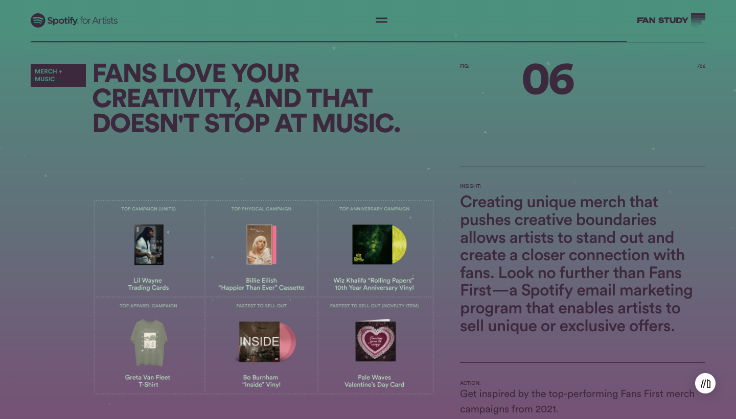
Along with being a practical guide to music merchandising, it’s a gorgeous visual experience. With its hazy background gradients that shift from purple to green, a dance of tiny triangles that respond to scrolling, and creative data visualizations, it feels modern and exciting. The design is aligned with Spotify’s brand, and creates an experience that keeps their readers engaged. We like seeing pillar page examples like Spotify’s that put extra effort into the visual experience along with delivering useful information to its visitors.
Adobe - Tips On How to Take Photos
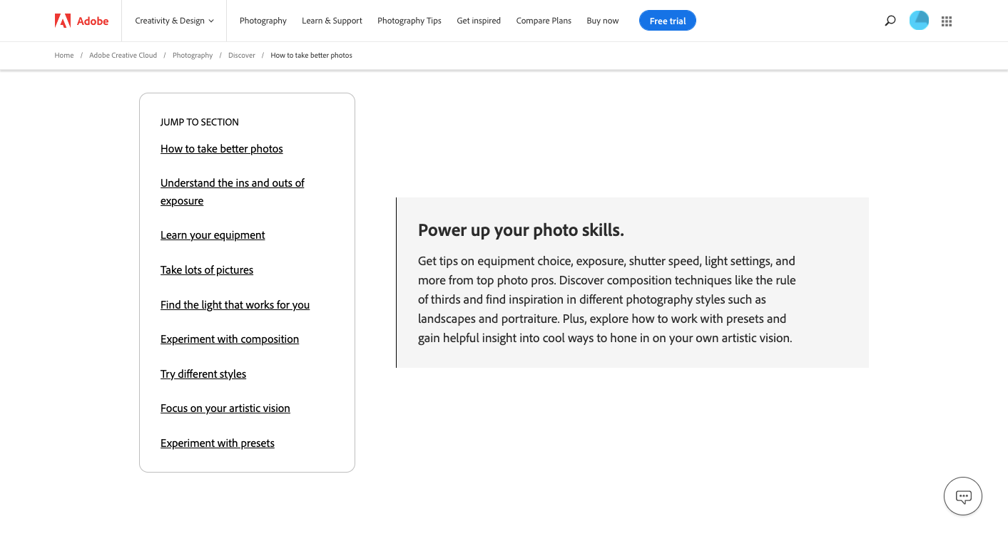
Adobe's Tips on how to take good photos has a clean and simple design that doesn't push things too far visually as far as pillar page examples go, but stands out with its pure representation of the brand, product and topic at hand.
At the top, a bold hero section is followed by an index tucked into the left-hand side that takes you to the main topics covered like ‘how to take better photos’, ‘experiment with composition’, and ‘focus on your artistic vision’. With nine different sections, this acts as a quick guide to the page. Each primary topic is filled with internal links to additional content that goes even deeper into details. Concepts like aperture, shutter speed, and the rule of thirds all are introduced, and internal links give opportunities to explore these topics even further.
This guide succeeds in demonstrating Adobe’s expertise, as well as being packed with search engine optimized text that likely helps it rank better in the organic search results related to photography.
Fender - How to Play Guitar
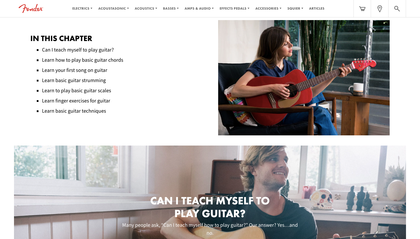
Since its launch of the Esquire guitar in 1950, Fender has had a huge presence in music. From the psychedelic-drenched fury of Jimi Hendrix to the upbeat jangle of Johnny Marr of the Smiths, so many influential musicians have used Fender guitars in channeling their art.
How to play the guitar is one pillar in a larger beginner’s guide Fender has put together, and covers all of the basics someone would need to know. This page touches on topics like chord charts, strumming, scales, finger exercises, and other fundamentals beginners need to know, as well as internal links to supplemental content. There is plenty of helpful information but it never feels overwhelming, instead focusing its efforts on getting people excited about learning how to play. It’s great to see pillar page examples like Fender’s that welcome potential new customers with an easy way to get started with a product or interest.
TrustRadius - What Is Intent Data and How to Use it
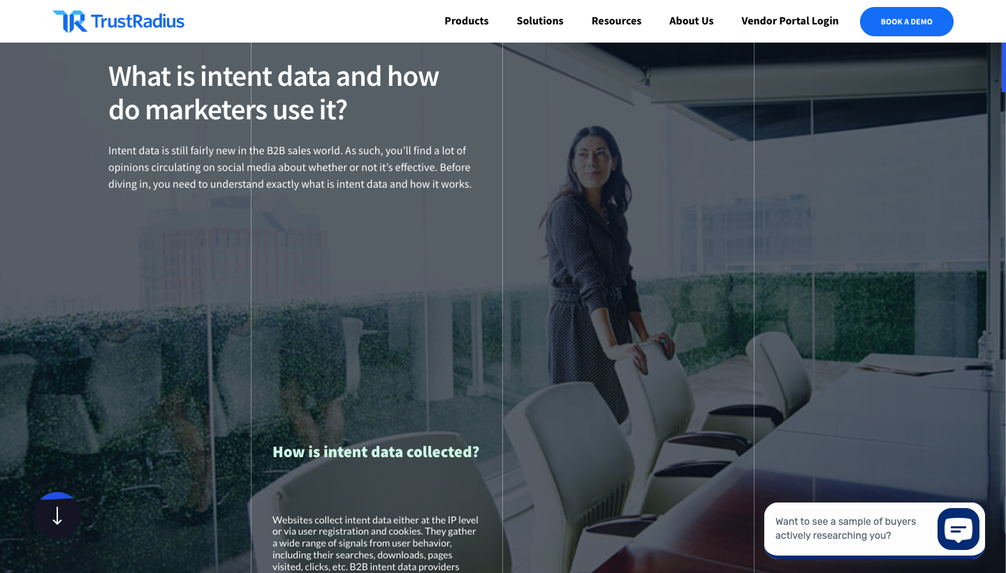
TrustRadius is a space where companies can find reviews and information about software and other technology products, helping them research and decide what might work best for their requirements.
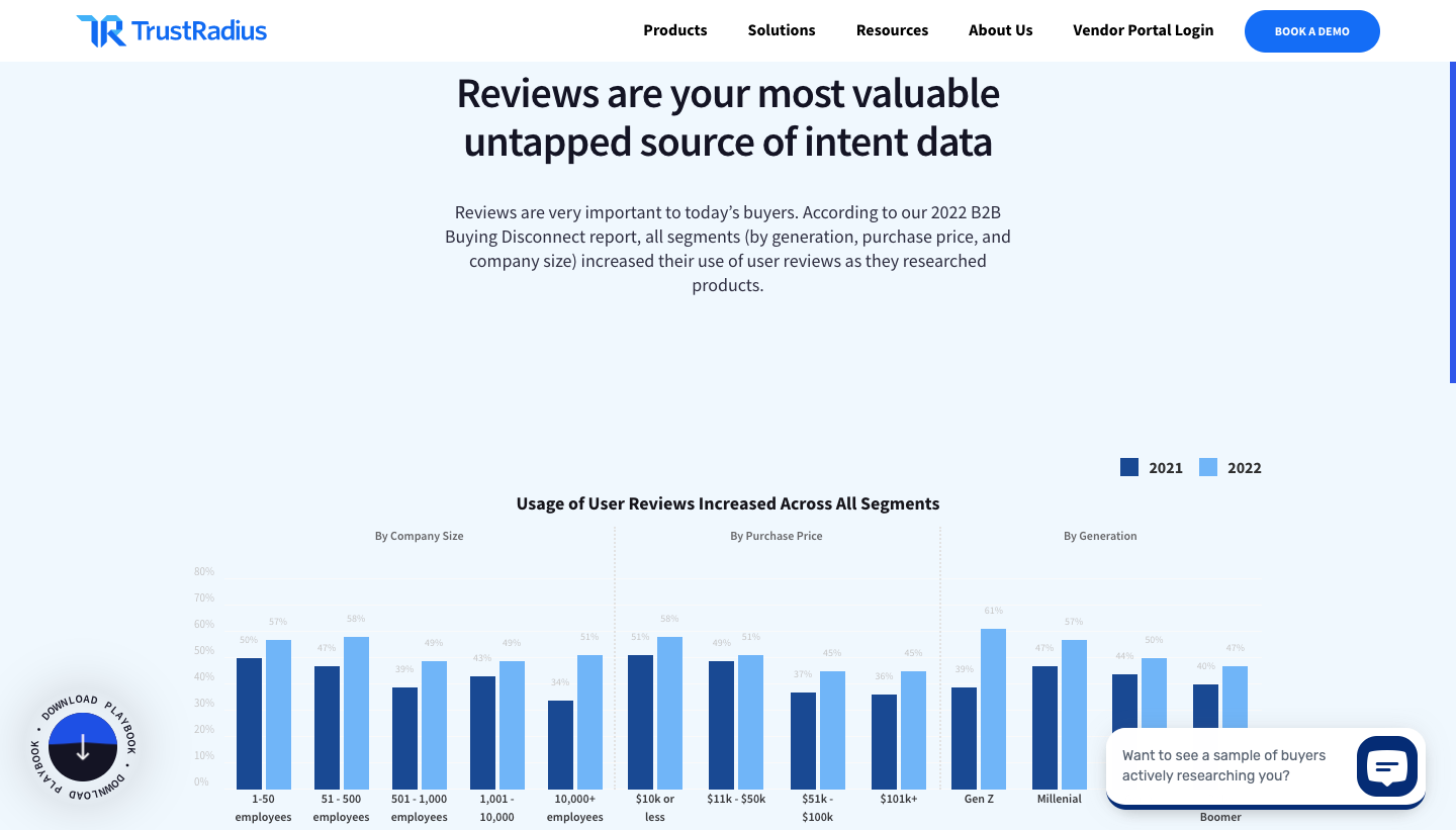
TrustRadius has an impressive pillar page covering intent data, that shows how companies can use it in cultivating new leads, putting togethering marketing campaigns, and growing their customer base. A number of design features make this page a winner when it comes to retaining reader interest. Animated charts spring into action upon scroll, and a scroll progress bar tracks progress and urges you to keep going to the end. Scroll-triggered animations are a massive must-do right now — they greatly improve UX, and also modernize a static webpage in need of some love. TrustRadius flex their expertise with a guide that’s both well-written and informative.
Messente - What is SMS Marketing? An Expert Guide
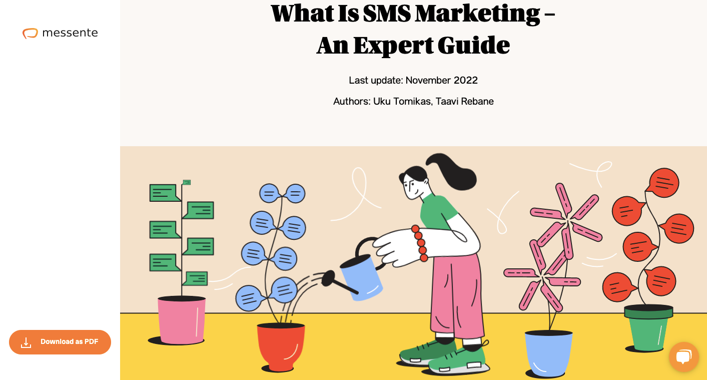
Messente specializes in SMS marketing, offering a platform and API that businesses can use to send text messages out to their customers. What is SMS Marketing examines aspects like the psychology behind it, the different types of SMS marketing, and how businesses can implement and launch campaigns of their own.
This pillar page does a great job of explaining what SMS marketing is and how it can benefit companies. Along with insightful content, there are plenty of fun visuals, with colorful illustrations and animations sprinkled throughout. We love seeing pillar page examples that have a creative and strong visual identity, and Messente fills theirs with bright colors and personality.
Design and Launch Pillar Pages with Vev
Pillar pages can take on different forms depending on the focus of the content. Whether you’d like to put together a how-to guide, an informational page, or some other learning resource, Vev gives you the flexibility to build any type of pillar page with no coding required. With a library of pre-built animations and effects that will enliven your design with motion and interactivity. When you’re done, publish your page anywhere on the web.